The following is a list of Upbound documentation customizations that expand traditional Markdown. Most of these are custom Hugo Shortcodes.
Markdown
Upbound documentation uses Hugo to render Markdown to
HTML. Hugo supports Commonmark and
GitHub Flavored Markdown (GFM) through the
Goldmark parser.
GFM are extensions to the
standard Markdown language.The docs support standard Markdown for images, links and tables. Use the custom shortcodes provides a better user experience.
Hide long outputs
Some outputs may be verbose or relevant for
a small audience. Use the expand shortcode to hide blocks of text by default.
apiVersion: apiextensions.crossplane.io/v1
kind: CompositeResourceDefinition
metadata:
  name: xpostgresqlinstances.database.example.org
spec:
  group: database.example.org
  names:
    kind: XPostgreSQLInstance
    plural: xpostgresqlinstances
  claimNames:
    kind: PostgreSQLInstance
    plural: postgresqlinstances
  versions:
  - name: v1alpha1
    served: true
    referenceable: true
    schema:
      openAPIV3Schema:
        type: object
        properties:
          spec:
            type: object
            properties:
              parameters:
                type: object
                properties:
                  storageGB:
                    type: integer
                required:
                - storageGB
            required:
            - parameters
The expand shortcode can have a title, the default is “Expand.”
{{< expand "A large XRD" >}}
```yaml
apiVersion: apiextensions.crossplane.io/v1
kind: CompositeResourceDefinition
metadata:
  name: xpostgresqlinstances.database.example.org
```
{{< /expand >}}
expand shortcode requires opening and closing tags. Unclosed tags causes
Hugo to fail.Hints and alert boxes
Hint and alert boxes provide call-outs to important information to the reader. Upbound docs support four different hint box styles.
Create a hint by using a shortcode in your markdown file:
{{< hint "note" >}}
Your box content. This hint box is a note.
{{< /hint >}}
Use note, tip, important, or warning as the hint value.
hint shortcode requires opening and closing tags. Unclosed tags causes
Hugo to fail.Images
Save images in the /images directory of the section using the image.
For example, save images related to contributing to the docs in /content/contribute/images.
The docs support standard
Markdown image syntax
but using the img shortcode is strongly recommended.
Images using the shortcode are automatically converted to webp image format,
compressed and use responsive image sizing.
img shortcode doesn’t support .SVG files.The shortcode supports the following options:
src- Required. The location of the image file, relative to/content.alt- Required. The image alt text for screen readers.align- Optional. Change the image alignment on the page withalign=centeroralign=right. By default images align left.size- Optional. Resizes the image. Useful for large images that need downscaling.quality- Optional. A value between 1 and 100. Change the image quality to increase image quality or decrease image file size. The default isquality=75.lightbox- Optional. Set tofalseto turn off the full-sized image pop.
Resize images
The size can be one of:
xtiny- Resizes the image to 150px.tiny- Resizes the image to 300px.small- Resizes the image to 600px.medium- Resizes the image to 800px.large- Resizes the image to 1200px.
By default the image isn’t resized.
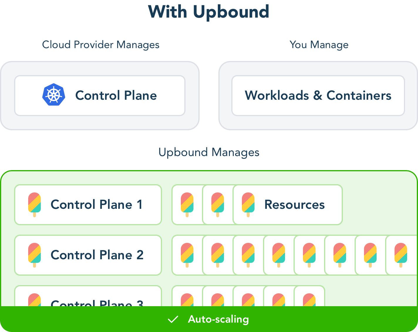
An example of using the img shortcode:
{{< img src="/concepts/images/WithUpbound.png" alt="Control planes with Upbound" >}}
Which generates this responsive image (change your browser size to see it change):
Generate a smaller image with a size smaller than the original.
For example,
{{< img src="/concepts/images/WithUpbound.png" size="xtiny" alt="Control planes with Upbound" >}}
Generates this image
Tables
The docs support extended markdown tables but the styling isn’t optimized.
| Title | A Column | Another Column |
|---|---|---|
| Content | more content | even more content |
| A Row | more of the row | another column in the row |
Wrap a markdown table in the {{< table >}} shortcode to provide styling.
table shortcode requires a closing /table tag.{{< table >}}
| Title | A Column | Another Column |
| ---- | ---- | ---- |
| Content | more content | even more content |
| A Row | more of the row | another column in the row |
{{< /table >}}
| Title | A Column | Another Column |
|---|---|---|
| Content | more content | even more content |
| A Row | more of the row | another column in the row |
Bootstrap provides styling
for the table shortcode. The docs support all Bootstrap table classes passed
to the shortcode.
Striped tables
To create a table with striped rows:
{{< table "table table-striped" >}}
| Title | A Column | Another Column |
| ---- | ---- | ---- |
| Content | more content | even more content |
| A Row | more of the row | another column in the row |
{{< /table >}}
| Title | A Column | Another Column |
|---|---|---|
| Content | more content | even more content |
| A Row | more of the row | another column in the row |
Compact tables
For more compact tables use table table-sm
{{< table "table table-sm" >}}
| Title | A Column | Another Column |
| ---- | ---- | ---- |
| Content | more content | even more content |
| A Row | more of the row | another column in the row |
{{< /table >}}
| Title | A Column | Another Column |
|---|---|---|
| Content | more content | even more content |
| A Row | more of the row | another column in the row |
Tabs
Use tabs to present information about a single topic with multiple exclusive options. For example, creating a resource via command-line or GUI.
To create a tab set, first create a tabs shortcode and use multiple tab
shortcodes inside for each tab.
{{< tabs >}}

{{< tab "First tab title" >}}
An example tab. Place anything inside a tab.
{{< /tab >}}

{{< tab "Second tab title" >}}
A second example tab.
{{< /tab >}}

{{< /tabs >}}
This code block renders the following tabs
Both tab and tabs require opening and closing tags. Unclosed tags causes
Hugo to fail.